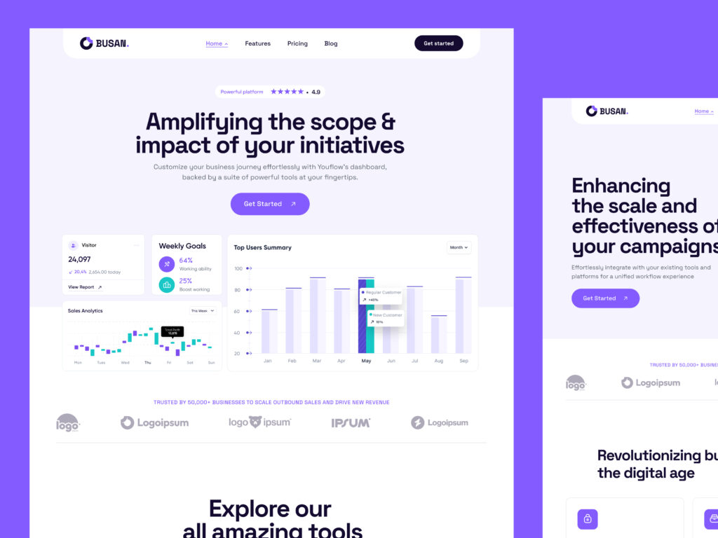
When it comes to design, typography is one of the most important elements to consider. Choosing the right font not only determines the aesthetic of your design, but it also impacts readability, user engagement, and brand recognition.
As one of the most commonly used fonts in the world, Helvetica is a staple for any designer. But its popularity means it can often feel overused or unoriginal… That’s why designers have started exploring Helvetica alternatives that have a more distinctive feel.
Try something fresh on your next design project and let your type choices breathe with these top 3 alternatives to Helvetica.
History of Helvetica
Helvetica has been widely used since the mid-20th century. Its original form, Neue Haas Grotesk (NHG), was licensed to Linotype AG in 1960 and renamed Helvetica for an international audience. Although derived from NHG, the new Helvetica font was not an entirely accurate reproduction, as several small details were altered during the typesetting process.
Valued for its clean lines and versatile uses, Helvetica quickly gained popularity in the design world. Over the decades, several typefaces have been influenced by Helvetica’s structure and style. Many modern sans serifs borrow its DNA but reinterpret its proportions, spacing, and stroke details to meet modern design needs.
Alternatives to Helvetica
Although there are several fonts like Helvetica, we’ve chosen Inter, Söhne, and Neue Haas Grotesk as our top 3 alternatives.
Inter
Known as one of the best free Helvetica alternatives for web design, Inter offers a professional yet approachable look without the licensing costs.
Although this typeface is similar to Helvetica, its generous spacing and gentle curves help create a softer appearance without losing precision. You can easily download Inter on Google Fonts or via the official Inter website.

History
Designed by Rasmus Andersson in 2016, Inter was created specifically for digital environments and is optimised for screen rendering at multiple sizes. Its open-source nature has made it a favourite for designers, developers, and product teams worldwide.
Standout features
- More open apertures and a tall x-height for enhanced legibility.
- Subtle curves contribute to a friendly, approachable feel.
Design suggestions
Inter is perfect for interfaces, dashboards, and SaaS products where clarity and scalability are key. It’s carefully designed to provide a balanced large-scale look, while still remaining legible at small sizes.
Söhne
Söhne offers efficiency and readability, while maintaining a warm and approachable feel. This font is similar to Helvetica in terms of structure but its subtle character makes it feel less corporate and more inviting. You can purchase Söhne directly from the Klim Type Foundry website.

History
Created in 2019 by Kris Sowersby of Klim Type Foundry, Söhne is inspired by Akzidenz-Grotesk and Helvetica.
Standout features
- More open apertures and smoother curves.
- Shallow joints contribute to a warm and friendly feel.
Design suggestions
Söhne is ideal for branding, editorial, and high-end web design where personality and clarity go hand-in-hand. It works beautifully with serif display fonts for brand systems, especially in industries like publishing and fashion.
Neue Haas Grotesk
With a 95% similarity score, Neue Hass Grotesk is the closest font to Helvetica. However, its original intention, optical tuning, and design restoration give it a slightly sharper, more purposeful aesthetic. You can purchase NHG directly from Commercial Type’s Neue Hass Grotesk Collection.

History
Neue Haas Grotesk is the original form of Helvetica, designed by Max Miedinger in 1958 and later restored by Christian Schwartz in 2010. It preserves the authenticity of the original design while refining it for modern production.
Standout features
- Tighter, more economical spacing.
- Slightly more variation in stroke width for a denser visual texture.
Design suggestions
NHG is a good choice for designers who love Helvetica’s neutrality but want a touch more authenticity and craftsmanship in their typography. It’s ideal for high-end branding, print design, and fashion editorials where subtle precision in type makes a big impact.
Obox Themes: Website Design Experts
Established in 2023, Obox Themes specializes in creating premium website templates to tell your story. Our expert team understands that typography makes a big difference. That’s why all our themes are fully customizable – allowing you to choose the perfect font to reflect your brand identity.
Whether you prefer classic typography or Helvetica font alternatives, you have the freedom to showcase your brand’s unique style. Get started with our range of expertly designed templates for Framer, Webflow, and Ghost.
Shop our website themes now to boost your brand’s online presence. Simply choose your font, perfect your design, and launch with confidence!